


Imagine if Disneyland – your favorite place – was painted in only one color, wouldn’t that be boring? In the article, “Unveiling the Magic: Exploring the Role of Color in Disneyland’s Design Palette”, you’ll discover how important color is to Disneyland’s design. Sure, you’re thinking, “It’s just color, what’s the big deal?” But trust me, color is like a secret spell that makes Disneyland feel so magical. Does the color of Sleeping Beauty’s Castle make you happy? Or the green of Adventureland makes you excited? These aren’t random choices, there’s a reason behind every color choice in Disneyland. This magical journey will take you through the rainbow of Disneyland and show you how color brings your favorite park to life!
The Magic in Colors: How Disneyland Utilizes Them
You know that wonderful feeling you get when you step into Disneyland? That’s not just because you’re in the “Happiest Place on Earth”–a lot of it has to do with the colors around you. Let’s explore the wondrous world of colors in Disneyland.
The Concept Behind Disneyland’s Color Choices
Disneyland’s design wizards (also known as Imagineers) use colors to create an enchanting experience. Each color is picked with care, designed to make every corner of the park feels magical.
Color Psychology Utilized in the Disneyland Parks
Color psychology is a way to understand how colors make us feel and act. Disneyland uses this to their advantage, with each hue carefully chosen to set the park’s happy, whimsical mood. The Imagineers choose colors to help you feel excited, adventurous, curious, and of course, happy as can be!
The Emotional Effects of Color in the Park Design
Colors aren’t just there to look pretty–they help you feel a certain way, too. So when you feel a wave of excitement looking at the vibrant reds and yellows of Mickey’s Toontown, or a sense of wonder at the sparkling blues of Sleeping Beauty’s Castle, you’re experiencing the magic of color.
The Signature Colors of Disneyland: Red, Yellow, Blue and White
At Disneyland, you’ll notice a lot of red, yellow, blue, and white. These are primary colors (the colors you can’t make by mixing others together), and they’re a key part of Disneyland’s color palette.
The Dominance of Primary Colors in Disneyland’s Palette
Primary colors are big stars in Disneyland. They give the park its signature bright, cheery look, and make everything from attractions to food stalls pop!
Symbolism of The Core Colors in Disneyland
The main colors at Disneyland are packed with symbolism. Red, for instance, denotes excitement and energy (much like your heart during a thrilling roller-coaster ride), while blue symbolizes serenity, ideal for those tranquil moments in Fantasyland.
How These Colors Enhance Your Experience
These colors do more than just paint the park pretty–they enhance your Disneyland experience, making it brighter, more thrilling, and absolutely unforgettable.

This image is property of pixabay.com.
Entrancing Blue: Disneyland’s ‘Go Away Green’ and ‘No Seeum Gray’
Every magic trick has a secret, and at Disneyland, it’s hidden in colors like ‘Go Away Green’ and ‘No Seeum Gray.’ Despite their cheeky names, they serve an important purpose in the park’s design.
Hidden Meanings of Disneyland’s Quirky Color Names
These unique shades are used to blend things into the background. ‘Go Away Green’ and ‘No Seeum Gray’ are used to hide service doors and fences, making sure your eyes only focus on the enchanting elements of the park.
Purpose and Role of These Unique Shades in the Park’s Design
The magic of these colors lies in their abilities to blend into the background, enhancing the illusion of an incredible, immersive reality that is made only of magic and joy.
How These Colors Play on Perceptions and Enhance the Visitor’s Experience
Subtly used, these colors ensure that the magic never breaks, enhancing your overall visitor experience.
Color and Architecture: Iconic Structures of Disneyland
From Sleeping Beauty Castle to It’s A Small World, the colors enlisted by Disneyland to create these iconic structures evoke feelings of joy, wonder, thrill, and nostalgia.
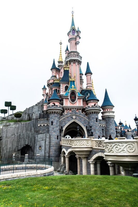
The Vibrant Colors of Sleeping Beauty Castle
The enchanting pinks, purples and blues of the Sleeping Beauty Castle make it a fairytale sight to behold, creating an air of fantasy and magic.
Mickey’s Toontown – A Spectrum of Bright Hues
Mickey’s Toontown, however, is a burst of bright primary colors, filling you with excitement and child-like joy.
The Technicolor World of It’s a Small World
And then there’s the colorful extravaganza of It’s A Small World, with its riot of colors bringing to life different cultures and creating a sense of unity and happiness.

This image is property of pixabay.com.
Seasonal Colors in Disneyland
Disneyland uses colors to celebrate seasons and holidays, redefining its look and feel with each changing season.
Special Color Design during Halloween Time
During Halloween, oranges, purples, and blacks take over the park, creating a spirited (pun intended) atmosphere.
Winter Holidays – A Transformation in White and Color Light Display
Come winter, the park transforms into a winter wonderland with shades of white, blue, and twinkling lights creating a festive and cozy environment.
Spring Colors for Disney’s Easter and Summer Splash
And as Spring brings Easter and summer, the park bounces back into vibrant colors and flowery decorations to match the lively season ahead.
Unveiling Disneyland at Night: A Symphony of Colors
Night time brings out the full glory of the park’s colors, turning Disneyland into a symphony of sparkling hues and lights.
The Transformation with Nightfall and Lighting
As day turns into night, the park transforms with glowing lights, bringing out deeper hues and creating an all-new magical experience.
Color and Light Shows: A Nighttime Spectacle
The night time light shows are especially spectacular, combining music and colors to create stunning performances that you’ll remember for a lifetime.
The ‘Paint The Night’ Parade and its Glowing Splendor
And, of course, the ‘Paint The Night’ parade is an after-dark spectacle full of glowing and vibrant colors, proving that Disneyland truly is the Happiest (and most colorful) Place on Earth.

This image is property of pixabay.com.
Colors in Costumes and Characters
From Mickey Mouse’s red shorts to Cinderella’s blue gown, colors play a huge part in making Disney characters who they are.
Interplay of Colors in Character Costumes
The colors of the character’s costumes not only make them recognizable but also evoke specific feelings and help tell their story.
How Characters’ Colors Enhance Their Personalities
For instance, the bold red and black of Mickey’s outfit exudes enthusiasm and excitement, while Cinderella’s dreamy blue dress exemplifies her grace and charm.
Symbolism and Importance of Color in Disney Iconography
Color symbolism plays a major role here, helping to bring the characters’ personalities to life and adding an extra layer of storytelling to the Disney experience.
Color, Food, and Merchandise
Even in the food stalls and merchandise, Disneyland Imagineers use color to enhance your experience.
The Role of Color in Food Presentation and Packaging
From brightly colored Popcorn buckets to the pastel teal of the mint julep, every color is chosen to make your dining experience as magical as the rides.
Color Schemes in Merchandise Design and Display
The vibrant colors of the merchandise are also designed to catch your eye, adding a touch of Disney magic to every product.
Color’s Effect on Guest Purchases and Perceptions
Furthermore, the colors used also psychologically influence guest purchases, making you want to buy more to remember your magical vacation.
Color and Empathy: How Disneyland Color Palette Evokes Emotion
Disneyland intentionally uses colors to make you feel a certain way.
The Emotional Triggers of Certain Colors
Subtle changes in color can shift your feelings. For instance, the calming blues and teals in Adventureland can feel like a comforting lull after the energetic reds and yellows of Frontierland.
Color Variation to Enhance the Feeling of Adventure and Fantasy
Color variation is an essential tool to enhance what Disneyland is all about – creating feelings of adventure, fantasy, and most importantly, happiness.
The Subliminal Messages in the Color Choices
While you enjoy your day at the park, these colors are triggering sensations and memories, shaping your overall perception of Disneyland.
The Realists Take
Disneyland’s color palette is a remarkable blend of artistic and psychological expertise.
Disneyland’s Color Palette – An Artistic and Psychological Masterpiece
From the primary hues to the tranquil ‘No Seeum Gray,’ each color is chosen with utmost precision to create an exciting and magical environment.
Creative Critiques of Disneyland’s Color Choices
While some might argue that the colors could be more adventurous or unique, there’s no denying the joy that the familiar palette and the nostalgia it brings.
The Role of Nostalgia and the Future of Color in Disneyland
Who knows what the future holds for the Disneyland color palette, but we can bet it will continue to evoke feelings of nostalgia, joy, and a magical time had by all!